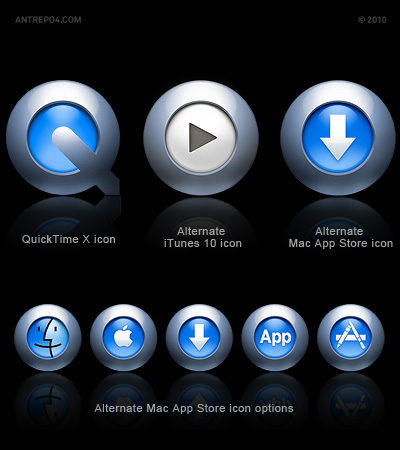
With the release of iTunes 10 on September 1, Apple has revamped the application's icon for the first time in many years, doing away with the traditional design of music notes on top of a CD. If you don't like new iTunes 10 icon (like us). You can customize it with our new icon (inspired by QuickTime X icon).
How to:
Remove iTunes from Dock. Download our new icon and expand zip file. Right click the iTunes software and select "get package contents" from submenu, Open (contents > Resources) folder and put new file (after back-up original icon for restore) Add iTunes shortcut to your dock. That's it!
Windows users can download expanded icon pack (png and all icon files)
Update:
Apple has released Mac App Store on January 6, 2011, we liked it very much, except one thing, another ugly icon came with the mac app store after itunes 10.
Of course we prepared again new icon. Also this time, it comes with 4 more options, because we don't like "pen-ruler-brush" and we try to find a few suggestions for "application"
How to:
Remove "App Store" from Dock. Download our new icons and expand zip file. Right click the "App Store" software and select "get package contents" from submenu, Open (contents > Resources) folder and put new file (after back-up original icon for restore) Add "App Store" shortcut to your dock. That's it!


14 comments:
Beautiful and good idea
I'm using it! I'm not usually one for messing around with such things, but the icon for 10 is rather Garish.
Agreed, it is pretty unattractive, this looks much better in the dock. Thank you!
congrats - your icon is the best one from all the replacement icons I've seen yet.
nice icon
but the play sign is a bit fuzzy at 16px
I like! Looks nice in the dock. Thanks!!!
I'm not using it, but this is one of the best replacement-icons i've seen. The good only one, actually!!
Only wish that the inner circle was blue and not white, would be perfect.
Beautiful icon, congrats! I''ll use it as soon as I have iTunes 10 installed.
Thanks for the icon. However, it would make it much easier to locate in my Downloads folder if the .zip had a helpful name. Currently it comes down as "icon.zip".
Again, thanks for the great replacement icon.
Thanks for the info. I will change it now.
Nice take.
The iTunes 10 logo is likely meant to be consistent with the iTunes logo for iPhone/Touch/iPad. Keeping that in mind, I don't mind it so much.
Yes, I just hate the new icon, it looks so early 2000 and I feel like is not part of the mac family, it is more like windows style.
Great improvement, thanks muchly!
Post a Comment